Veevart Donation
Redesigning a donation checkout that lost 3 in 4 donors
- Role
- Product Designer, Fundraising
- Company
- Veevart
- Team
- Fundraising product squad (design, product, engineering)
- Timeline
- 2 months
My role focused on
At a glance
The problem
75% of donors abandoned at the payment step, blocked by a long personal-info form they had to fill in before they could give a cent.
The insight
Donors give partly for the tax receipt, so the billing details had to stay. The move was to resequence, not remove: pay first, add the receipt details only if you want them.
The impact
Payment drop-off fell from 75% to 35%, and capturing the email first grew the marketing pool for abandoned gifts by 85%.
Payment drop-off
More than halved
Marketing pool
Captured email-first
Major-donor gift
The highest-value segment
01, Context
A fundraising product falling behind its market
Veevart is a Salesforce-based B2B platform for museums, foundations, and cultural institutions. I designed for the fundraising product, mid-way through a full UX and technology overhaul.
We were behind our competitors, and clients wanted two things: let donors personalize their gift, and, above all, convert.
Why it matters
10K+
Typical gift from a major donor
Older donors, the highest-value contributors
2
Distinct donor segments
High-value occasional givers, and smaller but frequent ones
Step 2
Where the funnel collapsed
The payment step, blocked by an overloaded form
02, The problem
Three out of four donors quit at payment
Pendo showed us exactly where we bled. 75% of prospective donors abandoned at step 2, the payment step, defeated by how much information the checkout demanded before it would take a cent.
The form asked everyone for everything, upfront. The people most willing to give were the ones we were turning away.
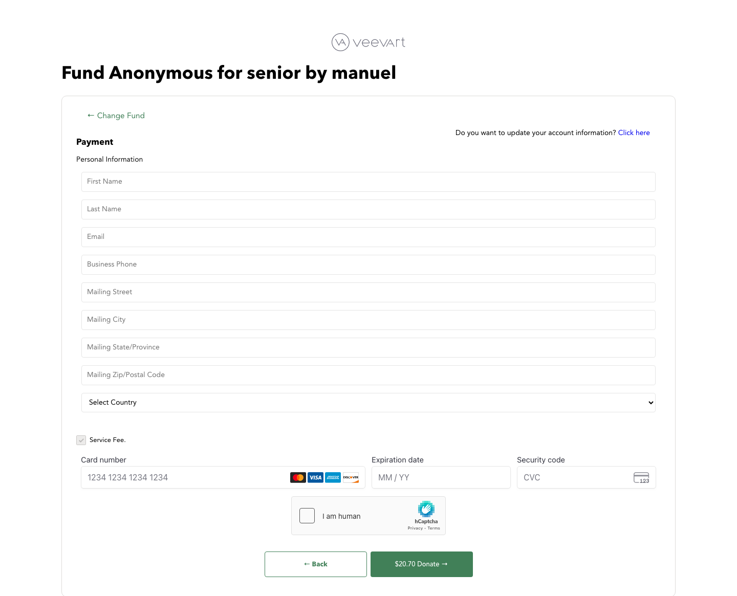
The legacy payment step
Captured from the old production flow. This is the exact step Pendo measured at 75% abandonment.
- ✕Nine personal-info fields, name, phone, full mailing address, and country.
- ✕All of it demanded before the card fields even appear.
- ✕Then card details, then an hCaptcha, one last wall before Donate.
- ✕A dated, generic layout with no sense of the cause behind the gift.
03, Research
What today's donors expect
We paired the funnel data with donor interviews. What surfaced was a generational shift in what giving means, and how little friction today's donors will tolerate to get there.
Where does my money actually go?
Donors expect to see what their gift funds and the impact it creates, not just a thank-you page.
Let me choose what I support
Directing a gift to a specific fund or program matters more than the institution's brand.
Recognize me, and thank me
Acknowledgment turns a one-time gift into a relationship worth repeating.
I want to share it
Posting the act on social media motivates others and gives the gift meaning beyond the transaction.
04, Who we designed for
Two donors, one flow
The interviews surfaced two distinct donors the checkout had to serve at once. Designing for the average of them would have failed both.
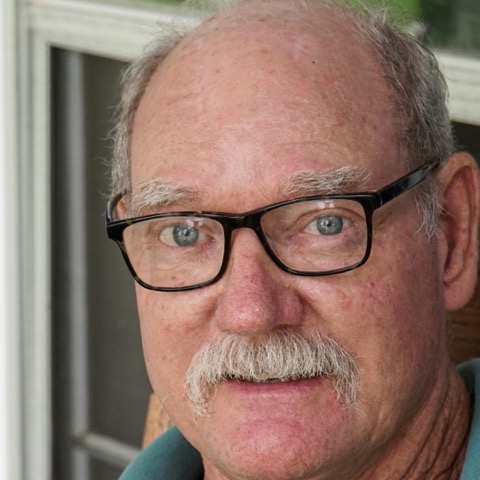
The major donor
Older, high-trust, gives occasionally but big.
What they need
- A tax receipt for the deduction
- To feel recognized, not processed
- No friction that makes a large gift feel risky

The frequent giver
Younger, smaller amounts, but far more often.
What they need
- To see where the money goes
- To give in seconds, on mobile
- To share the act and bring others in
05, Competitive analysis
Validate to convert, not to copy
Givebutter and Zeffy were ahead of us, easier to understand and to customize. We studied them not to copy features, but to validate which patterns actually moved our metrics, and to fix first where we were losing donors, not where a competitor happened to ship.
06, Design principles
The rules the redesign had to obey
From the research and the funnel data we set four principles. Every decision that followed was measured against them.
Validate, don't copy
A borrowed pattern had to earn its place by moving a metric, not by matching a competitor.
Ask only when it pays off
Collect the minimum needed to complete the gift; everything else is optional and comes later.
Convert first, enrich after
Secure the payment, then invite the donor to add the details that serve them.
The gift is a relationship
Recognize, thank, and let donors share, so a transaction becomes a reason to give again.
07, Key decisions
How we cut the form without losing the receipt
The hard constraint: we could not drop billing details. Donors care about the tax benefits, and the detailed receipt depends on that information. So the question was not whether to ask, but when.
We split the flow. Checkout collects only an email and a payment method. After the gift is made, donors who want a detailed tax receipt can fill in the rest. The long form stops blocking the people who don't need it, and the payment happens in seconds.
Email-first checkout
We ask only for an email and a payment method to complete a gift. If a donor still leaves, we have the email, so an abandoned checkout becomes a follow-up, not a loss.
Tax receipt after payment, not before
Billing details drive the tax benefit, so we couldn't remove them. We moved them past the payment: give first, then complete the receipt only if you want it.
Give in someone's name
Donors can dedicate a gift to a person and notify them it was made, turning a private transaction into a shared act.
Guaranteed recurrence
Donors can set a fixed number of scheduled payments, so recurring support runs automatically instead of depending on them to return.
An experience each side can shape
Institutions tailor the donation page to their cause, and donors choose exactly which fund receives their money.
08, The flow
Three steps, with the friction moved to the end
The whole redesign in one view. Giving takes two screens, choose and pay, and the tax-receipt form only appears after the gift is secured, for the donors who actually want it.
Open donation page
From the campaign link
Choose the fund
General, education, conservation…
Set amount & frequency
Preset or custom · one-time to annual
Dedicate the gift
In honor or memory of someone
Guaranteed recurrence
Fix the number of payments
Notify someone
Name + message, by phone or email
Enter email
The one required field
Choose payment
Apple Pay · Google Pay · Card
Give
Payment in seconds
Gift made
Thank-you + social share
Tax receipt
Billing details, only for the deduction
09, The prototype
Try the redesigned checkout
An interactive recreation of the shipped flow, rebuilt in code. Give in someone's name, set the recurrence, then reach the payment step and notice what it asks for: an email and a card, nothing else. The tax receipt comes after the gift. Switch between desktop and mobile to see both.
CULTURE
A DOOR TO KNOWLEDGE
Museum Donations
Choose Your Fund *
How Your Donation Helps
Your donation helps create access to experiences that inspire learning, connection, and opportunity. Through your support, we can develop programs, tools, and spaces that allow more people to explore, participate, and grow.
Together, we're not just funding a program, we're opening doors for people to discover, learn, and be part of something meaningful.
10, Results
Fewer donors lost, more donors reached
The redesign reframed the funnel around a single idea: secure the gift first, enrich it after. The numbers followed.
Payment drop-off fell from 75% to 35%, less than half of what it was. And because checkout now captures the email before anything else, the pool of donors we could reach with marketing grew by 85%, an abandoned gift now leaves a lead instead of nothing.
Payment drop-off
The step Pendo flagged became the biggest win
Reachable for marketing
Even an abandoned gift now leaves a lead
Fields before payment
An email, then the card, down from a full form
Reflection
What I took from it
The biggest lever wasn't a new feature, it was the order of the questions. Resequencing what we asked for, and when, moved the metric more than anything we could have added to the page.
If I picked it up again, I'd instrument how many donors actually complete the optional receipt, and A/B how hard we nudge them, so the ask is right-sized with data instead of a guess.
Next project
MyPainPal